Over the past couple months, I’ve been teaching myself how to do art in the style of illuminated manuscripts from medieval Europe. (That’s actually a huge category, which covers hundreds of years and many cultures and therefore many many different styles, but you know what I mean…)
I started by copying pages out of random books – anything I could find a good reproduction of – but I’d been wanting to do something fully original, and when I read the call for art for HOME, the collaborative show between LexArt and LexHab, some things I’d been thinking about came together into the idea to do a piece about missing places that no longer exist in the way you remember them (specifically, my grandparents’ home).
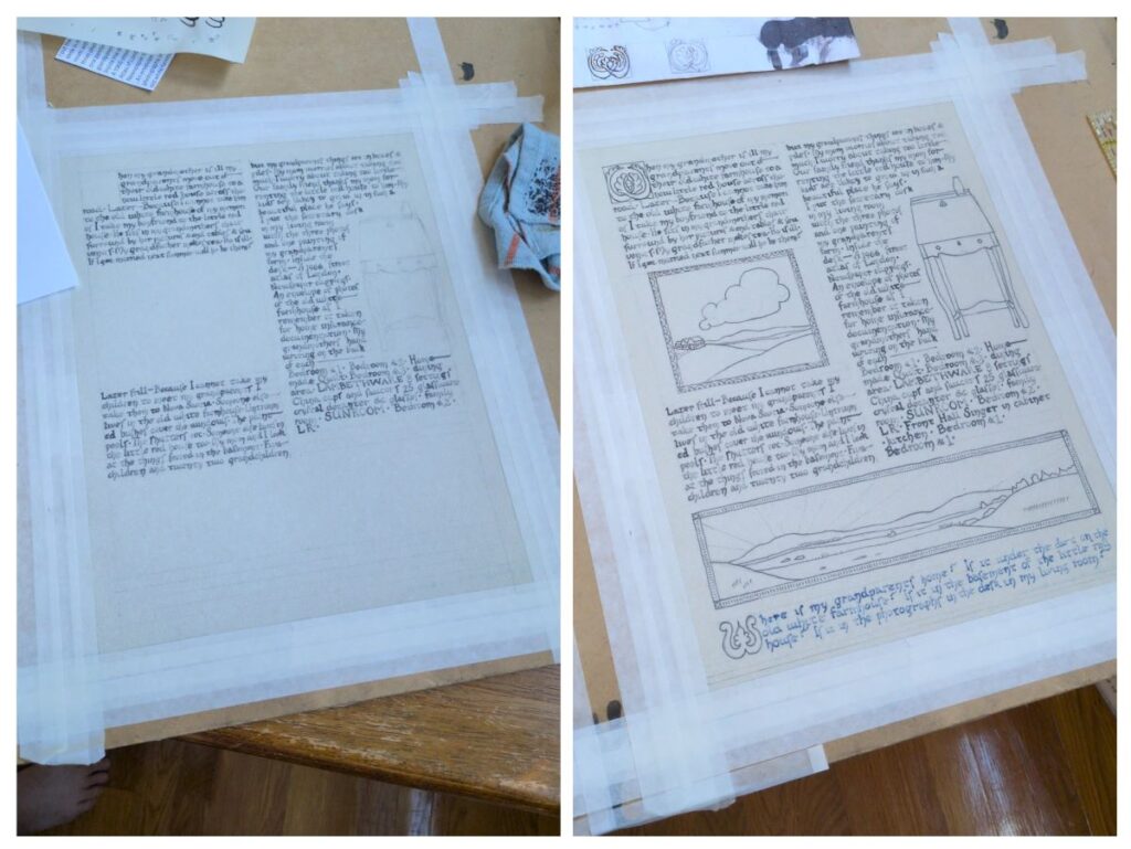
I started by writing a sort of journal entry, or maybe a sort of poetic personal essay? I don’t want to say I fictionalized anything, but I did maybe magnify a couple things for effect. The hardest part was editing it down so that I could fit it on a single page (thank you to my friend Nerissa who helped me with the initial round of cuts and edits!). I knew more or less what I wanted to do with the illustrations, and roughly where in the text I wanted them to fall, but it took a lot of work to figure out how to make the text fit properly. I wrote it all out four times on regular paper to work out the line spacing, quill size, and things like when to say “can’t” vs. “cannot”. On one version, I also did a draft of the illustrations, which you can see below:
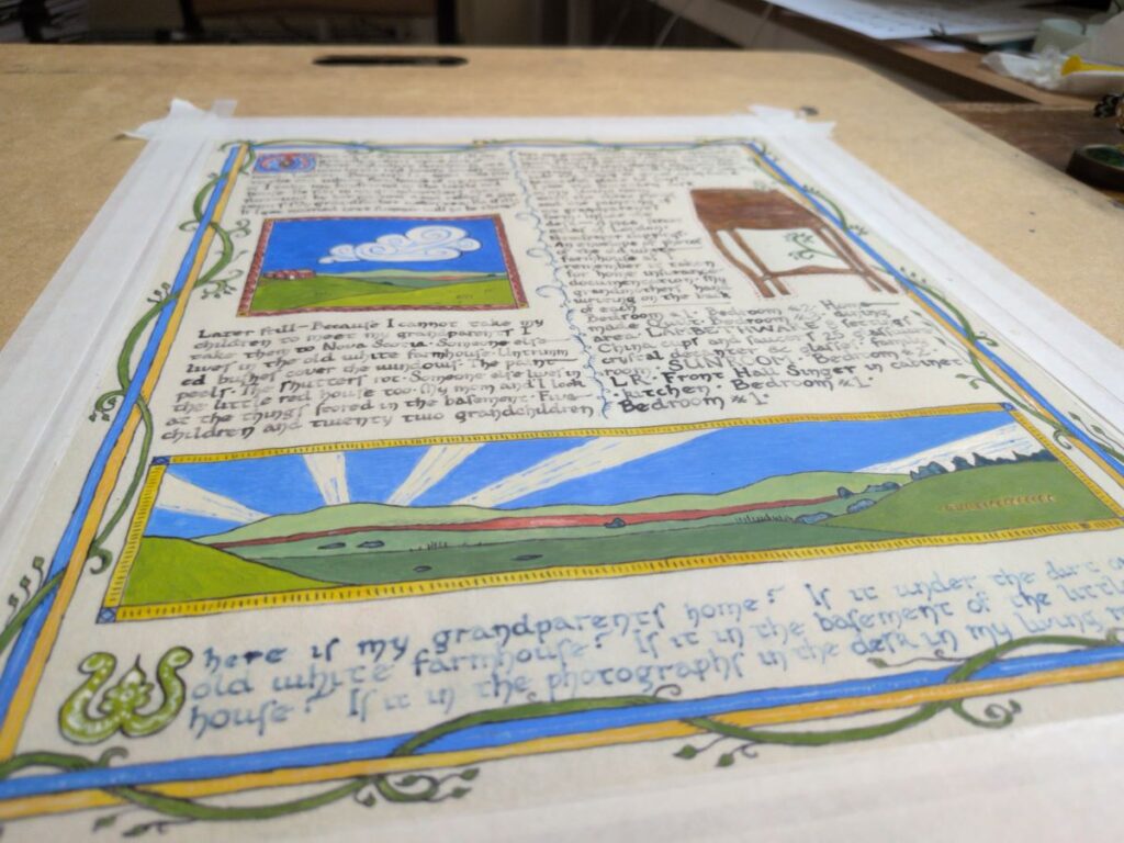
The real version was pretty straightforward by the time I got around to it, although it was a little stressful to worry about not smudging my work. I wrote the text, let it dry, and then inked the illustrations. Perhaps this is a good time to mention that the script is mostly based on Caroline minuscule, although I did make it my own a little.
After the ink dried, I very carefully erased my pencil marks, and then started painting. I still find it quite challenging to get an even texture with the egg tempera paint – I feel like there must be some kind of trick to it that I haven’t figured out yet. I made the brown extra eggy because it made it streaky and shiny in a way that does look quite a lot like wood stain.
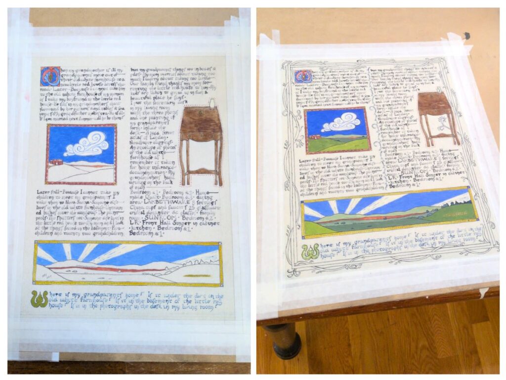
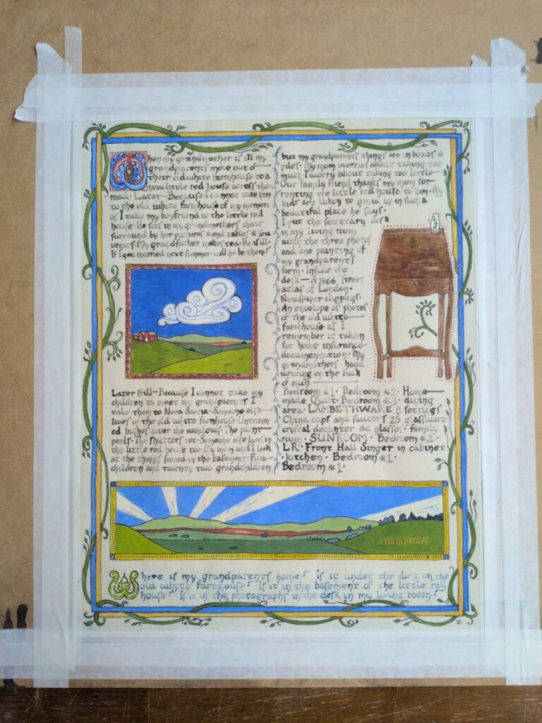
After the paint is on, I went back in with the ink to go over any lines that got a bit covered or didn’t look dark enough, and used white ink to add some highlights. I found this piece very challenging to photograph – the angled shot is more accurate in terms of color and paint texture.
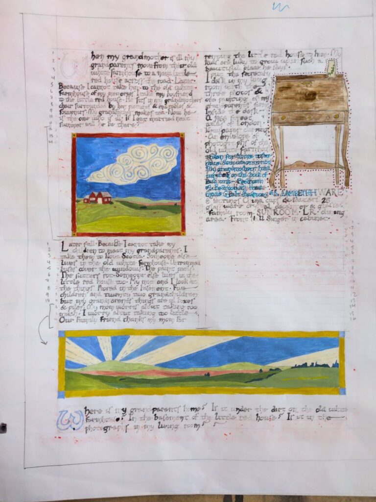
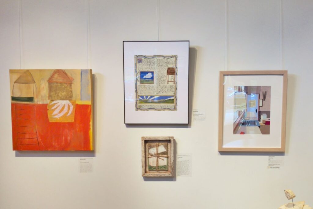
I was pretty pleased with how this piece came out. You can see a high resolution scan of the final version here, and here it is on the wall in the gallery with its friends at the HOME show:
Details:
“Attachment”, 2025, 11 inches by 14 inches
Materials & tools:
- Pergamenata parchment paper
- McCaffery’s Penman’s Ink in black (an iron gall ink), white, and indigo blue
- Quill pens for the lettering (I bought these precut ones and modified the nibs)
- G-nib dip pen for the lines in the illustrations
- Sennelier egg tempera paint in carmine, red brown, cadmium yellow light genuine, cobalt blue genuine, ultramarine blue, burnt umber, Van Dyck brown, and zinc white
- Paintbrushes (Princeton Neptune 2 round, Da Vinci Cosmotop Spin 4 round, Da Vinci Cosmotop Spin 3/0 round)
- Pro drafting tape
- Pencil
- Omnigrid ruler
- Eraser