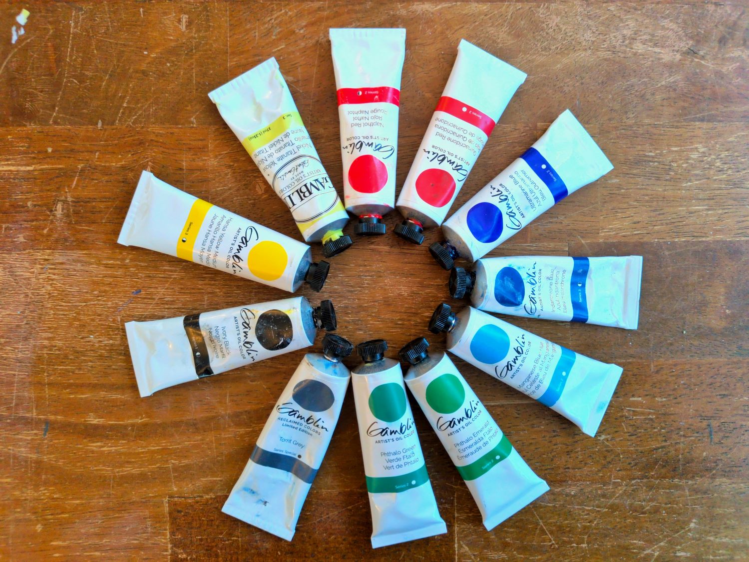
I often find myself in an art store holding a new tube of paint, trying to decide if I really need it or if I should just get by with the ones I already own. One of the things I like about Gamblin paints is that their website provides all the information you need to answer that question: there’s the “Color Temperature and Value List“, which is a very helpful table listing the Munsell color values for all their paints; and the Gamblin Artist’s Oil Colors page has really good photos of color swatches, little blurbs about what is special or useful about each paint, and information on pigment, vehicle, and lightfastness.
However, despite having all the information I want, the swatch page isn’t organized the way I’d like it to be. The information is all in little pop-ups when you click on the swatches, instead of in a table, so you can’t ctrl+F to look for something. I keep finding myself scrolling around, opening and closing pop-ups, whispering to myself, “Ok, so Olive Green is a mix of PBr 7, PY 75, PB 29… PBr is Burnt Umber, maybe? But which yellow and blue are those…?”
So, I decided to make my own table and put it online. All the information below is from the Gamblin website, either the Gamblin Artist’s Oil Colors page or the New Colors 2026 page. I’ve broken it into two tables: one for single pigment paints, and a second for multi-pigment paints. I used the Excel export as web page function to make these tables, so they’re not the most beautiful/responsive html ever, but you should be able to ctrl+F to search for a pigment code.
SINGLE PIGMENT PAINTS || MULTI-PIGMENT PAINTS

Gamblin Single Pigment Paints
This table lists the Gamblin single pigment Artist’s Oil Colors, as of February 2026. They’re in the same order as on the Gamblin website, with the exception of Cobalt Turquoise, a new color that isn’t on the Gamblin Artist’s Oil Colors page yet (so I guessed where it would fit in). For each paint, I’ve given a color swatch (I used a color picker on the real swatches to get something fairly representative), the name of the paint, the pigment code, the chemical name of the pigment (where provided), a brief description of the color, whether it’s opaque (O), transparent (T), or semi-transparent (S-T), and its series (higher series numbers are more expensive).
All of these paints are made with a single pigment, so in some sense they’re each unique, but some can be pretty well approximated by mixing others. For example, it’s possible to mix a color that is identical (to my eyes) to Yellow Ochre from Burnt Umber and Hansa Yellow Medium. Gamblin mentions a couple colors as being particularly difficult to approximate from other colors: Permanent Orange, Cobalt Violet, Cobalt Blue, and Cobalt Green.
Not included in this table are the Reclaimed Earth Colors, as they are limited edition, but I believe those are all iron oxide.
| Swatch | Paint name | Pigment code | Pigment name | Color description | Transparency | Series |
| #FADC47 | Cadmium Lemon | PY 35 | CP cadmium zinc sulfide | Coolest cadmium yellow | O | 4 |
| #EBD132 | Cadmium Yellow Light | PY 35 | Concentrated cadmium zinc sulfide | Cool yellow | O | 4 |
| #DFC103 | Cadmium Yellow Medium | PY 37 | Concentrated cadmium sulfide | Warm yellow | O | 4 |
| #EE9F00 | Cadmium Yellow Deep | PY 37 | Concetrated cadmium sulfide | Warm yellow | O | 4 |
| #DDC751 | Nickel Titanate Yellow | PY 53 | Nickel antimony titanium yellow | Cool muted yellow | O | 3 |
| #FDDD00 | Hansa Yellow Light | PY 3 | Arylide yellow | Coolest yellow | S-T | 3 |
| #DCB100 | Hansa Yellow Medium | PY 74 | Arylide yellow | Warm yellow | S-T | 3 |
| #FBA800 | Hansa Yellow Deep | PY 75 | Arylide yellow | Warmest hansa yellow | S-T | 3 |
| #E86700 | India Yellow | PY 83 | Diarylide yellow | Warm yellow, bright glaze | T | 3 |
| #E87902 | Cadmium Orange | PO 20 | Concentrated cadmium sulfo-selenide | Warm medium orange | O | 4 |
| #E45601 | Cadmium Orange Deep | PO 20 | Concentrated cadmium sulfo-selenide | Warm deep orange | O | 4 |
| #E66700 | Permanent Orange | PO 62 | Monoacetolone | Warm bright orange, can’t mix | S-T | 3 |
| #650003 | Alizarin Crimson | PR 83 | Synthetic 1:2 dihydroxyanthraquinone on alumina | Cool red, poor lightfastness | T | 3 |
| #691115 | Alizarin Crimson Permanent | PR 177 | Anthraquinone red | Cool red | T | 3 |
| #E52B02 | Cadmium Red Light | PR 108 | Concentrated cadmium sulfo-selenide | Warm red | O | 5 |
| #D80001 | Cadmium Red Medium | PR 108 | Concentrated cadmium sulfo-selenide | Warm red | O | 5 |
| #AC0001 | Cadmium Red Deep | PR 108 | Concentrated cadmium sulfo-selenide | Warm red | O | 5 |
| #C00000 | Napthol Red | PR 112 | Napthol AS-D | Warm red | S-T | 2 |
| #D70101 | Napthol Scarlet | PR 188 | Napthol AS-OL | Warm red | S-T | 2 |
| #A70000 | Perylene Red | PR 149 | Perylene | Warm red, brght glaze | T | 2 |
| #84002B | Quinacridone Magenta | PR 122 | Quinacridone Y | Coolest red | T | 3 |
| #84001F | Quinacridone Red | PV 19* | Quinacridone red b | Cool red | T | 3 |
| #4E091E | Quinacridone Violet | PV 19* | Quinacridone Violet | Cool red / warmest violet | T | 3 |
| #4F006D | Cobalt Violet | PV 14 | Cobalt phosphate | Warm violet, can’t mix | T | 6 |
| #3E255A | Ultramarine Violet | PV 15 | Complex silicate of sodium & aluminum with sulfur | Warmer than Co Violet, cooler than Mn Violet | T | 2 |
| #431176 | Dioxazine Purple | PV 23 | Carbazol dioxazine | Coolest violet, intense glaze | T | 2 |
| #4A093E | Manganese Violet | PV 16 | Manganese ammonium phosphate | Warm violet | S-T | 3 |
| #0F6BAA | Cerulean Blue | PB 36 | Oxides of cobalt & tin | Cool blue, muted tints | O | 6 |
| #002786 | Cobalt Blue | PB 28 | Oxides of cobalt & aluminum | Warm blue, can’t mix | S-T | 5 |
| #42A59D | Cobalt Teal | PB 28 | Oxides of cobalt & aluminum | Cool green-blue | O | 4 |
| #00706A | Cobalt Turquoise | PB 36 | Cool green-blue | O | 4 | |
| #088DBE | Manganese Blue Hue | PB 15:4 | Copper phthalocyanine | Cool blue, bright glaze | T | 2 |
| #002358 | Phthalo Blue | PB 15:2 | Copper phthalocyanine | Warm blue, intense tints | T | 2 |
| #1D2B4B | Prussian Blue | PB 27:1 | Ferri-ammonium ferrocyanide | Cool blue, muted tints | S-T | 2 |
| #062254 | Indanthrone Blue | PB 60 | Indanthrone | Warm blue | S-T | 3 |
| #041A5D | Ultramarine Blue | PB 29 | Complex silicate of sodium & aluminum with sulfur | Warm blue, bright glaze | T | 2 |
| #214A31 | Cobalt Green | PG 19 | Oxides of cobalt and zinc | Cool green, muted tints, can’t mix | S-T | 4 |
| #054735 | Phthalo Green | PG 7 | Chlorinated copper phthalocyanine | Cool green, intense tints | T | 2 |
| #064C26 | Phthalo Emerald | PG 36 | Chlorinated and bromated copper phthalocyanine | Warm green, intense tints | T | 2 |
| #1C382E | Viridian | PG 18 | Hydrated chromium oxide | Cool green, muted tints | T | 4 |
| #4B5F2C | Chromium Oxide Green | PG 17 | Anhydrous chromium sesquioxide | Warm green, muted tints | O | 3 |
| #56560F | Green Gold | PY 129 | Azomethine Yellow 56 | Warm green, cool yellow as glaze/tint | S-T | 4 |
| #662C20 | Burnt Sienna | PBr 7 | Calcined natural iron oxide | Warm brown | S-T | 1 |
| #3C2118 | Burnt Umber | PBr 7 | Calcined natural iron oxide, containing manganese | Warm brown | S-T | 1 |
| #902714 | India Red | PR 101 | Synthetic red iron oxide (bluish shade) | Warm brown | O | 1 |
| #872A00 | Venetian Red | PR 101 | Synthetic red iron oxide (yellowish shade) | Warm brown | O | 1 |
| #AF682A | Raw Sienna | PBr 7 | Natural iron oxide | Warm brown | S-T | 1 |
| #3A2E21 | Raw Umber | PBr 7 | Natural iron oxide containing manganese | Cool brown | S-T | 1 |
| #956100 | Yellow Ochre | PY 43 | Natural hydrated iron oxide | Warm brown | S-T | 1 |
| #5D3400 | Transparent Earth Yellow | PY 42 | Transparent Mars Yellow | Cool brown | T | 3 |
| #390D0C | Transparent Earth Red | PR 101 | Transparent Mars Red | Warm brown | T | 3 |
| #0C0A0B | Ivory Black | PBk 9 | Bone black | Neutral black, slightly warm as glaze | S-T | 1 |
| #100A0A | Mars Black | PBk 11 | Synthetic black iron oxide | Cool masstone, but slightly warm tint | O | 1 |
| #0C0707 | Black Spinel | PBk 29 | Copper chromite black spinel | Matte finish black | O | 4 |
| #BEB58E | Titanium Buff | PW 6 | Titanium dioxide | Warm yellow-grey | O | 1 |
| #E9E9E9 | Titanium White | PW 6 | Titanium dioxide | Most opaque white | O | 1 |
| #F0F0F0 | Radiant White | PW 6 | Titanium dioxide | Brightest white (safflower instead of linseed oil) | O | 2 |
| #E4E4E4 | Flake White Replacement | PW 6 | Titanium dioxide | Replacement for lead white, unique texture | O | 1 |
| #E6E6E6 | Zinc White | PW 4 | Zinc oxide | Most transparent white | S-T | 1 |
| #EDEDED | Fast Dry Titanium White | PW 6 | Titanium dioxide | Faster drying titanium white | O | 1 |
| #C28153 | Copper | PM 2** | Copper powder | Metallic copper | O | 4 |
| #948055 | Pale Gold | PM 2 | Bronze powder | Metallic green-gold | O | 4 |
| #C2935C | Rich Gold | PM 2 | Bronze powder | Metallic rose gold | O | 4 |
| #BBBAB5 | Silver | PM 1 | Aluminum powder | Metallic silver | O | 4 |
* Both Quinacridone Red and Quiacridone Violet have their pigment listed as PV 19, although the chemical names given are different. I don’t know why this is.
** Copper, Pale Gold, and Rich Gold all have pigment listed as PM 2, although Copper is described as “copper powder” while the others are described as “bronze powder” — possibly because bronze is mostly copper?
Gamblin multi-pigment paints
This table lists the Gamblin multi-pigment paints, as of February 2026. As with the single pigment paints, I used the ordering from the Gamblin website, except for the new 2026 colors, which I worked in wherever made the most sense. For each paint, I’ve given a color swatch, the name of the paint, the pigment codes, what I’m calling the “parent” paints (i.e. the single pigment paints for each of the pigments in the mix), a brief description of the color, whether it’s opaque (O), transparent (T), or semi-transparent (S-T), and its series (higher series numbers are more expensive).
In principle, you could mix each of the paints in the multi-pigment table yourself from the parent paints listed. Some artists see multi-pigment paints as wasted space in your paint box / on your palette, but depending on how you work, the consistent mix and saved time might be worth it. For most of these colors, the swatches on the Gamblin website have little blurbs to explain why the mix might be useful.
Not included in this table is Torrit Grey, which is a reclaimed paint that includes every pigment. The exact color of Torrit Grey varies; Gamblin says it often leans green, but my particular tube is a warm gray.
| Swatch | Paint name | Pigment codes | Parent paints | Color description | Transparency | Series |
| #D3C502 | Cadmium Chartreuse | PY 35, PG 36 | Cadmium Lemon, Phthalo Emerald | Cool green-yellow | O | 4 |
| #E04004 | Transparent Orange | PY 83, PR 149 | India Yellow, Perylene Red | Warm orange, bright glaze | T | 3 |
| #E84132 | Coral | PO 62, PR 188, PW 6 | Permanent Orange, Napthol Scarlet, Titanium White | Warm orange-red | O | 2 |
| #50000B | Brown Pink | PR 101, PR 149 | Transparent Earth Red, Perylene Red | Warm red, bright tints | T | 2 |
| #005FA5 | Cerulean Blue Hue | PW 6, PB 15:4 | Titanium White, Manganese Blue Hue | Cool blue | O | 2 |
| #1387CF | Sevres Blue | PB 15:4, PB 15:2 | Manganese Blue Hue, Phthalo Blue | Cool blue | O | 2 |
| #1D2025 | Indigo | PB 15:2, PV 15, PBr 7 | Phthalo Blue, Ultramarine Violet, Burnt Umber | Cool blue-black | S-T | 3 |
| #0F282E | Phthalo Turquoise | PB 15:2, PG 7 | Phthalo Blue, Phthalo Green | Cool turquoise, strong tints | T | 2 |
| #374F51 | Alpine Blue-Green | PB 28, PBr 7, PW 6 | Cobalt Blue, Burnt Umber, Titanium White | Cool green | S-T | 2 |
| #AEB301 | Cadmium Green | PY 35, PG 18 | Cadmium Yellow Light, Viridian | Warm yellow-green | O | 4 |
| #299102 | Permanent Green Light | PY 74, PG 7 | Hansa Yellow Medium, Phthalo Green | Warm green | S-T | 2 |
| #0D8042 | Emerald Green | PG 36, PW 6, PY 74 | Phthalo Emerald, Titanium White, Hansa Yellow Medium | Warm green | S-T | 2 |
| #1D2C05 | Sap Green | PY 83, PB 15:2 | India Yellow, Phthalo Blue | Warm green | T | 2 |
| #465830 | Forest Floor Green | PY 37, PB 29 | Cadmium Yellow Medium, Ultramarine Blue | Warm green | S-T | 2 |
| #52622D | Bush Green | PY 35, PY 43, PB 29 | Cadmium Yellow Light, Yellow Ochre, Ultramarine Blue | Warm green | S-T | 2 |
| #978C10 | Canopy Green | PY 35, PY 83, PB 29 | Cadmium Yellow Light, India Yellow, Ultramarine Blue | Warm yellow-green | S-T | 2 |
| #4E472A | Terre Verte | PBr 7, PG 18 | Burnt Umber, Viridian | Warm brown-green, muted tints | T | 2 |
| #3A3712 | Olive Green | PBr 7, PY 75, PB 29 | Burnt Umber, Hansa Yellow Deep, Ultramarine Blue | Warm brown-green | S-T | 2 |
| #E6C06C | Naples Yellow | PW 6, PY 75, PY 43 | Titanium White, Hansa Yellow Deep, Yellow Ochre | Warm pale brown/earthy yellow | O | 2 |
| #E0B188 | Naples Orange | PW 6, PY 43, PR 188 | Titanium White, Yellow Ochre, Napthol Scarlet | Warm pale brown/earthy orange | O | 2 |
| #B67926 | Gold Ochre | PY 43, PY 83 | Yellow Ochre, India Yellow | Warm light brown/earthy yellow | T | 2 |
| #440502 | Transparent Earth Orange | PY 42, PR 101 | Transparent Earth Yellow, Transparent Earth Red | Warm brown/earthy orange | T | 3 |
| #3C2C24 | Asphaltum | PR 101, PB 29 | Transparent Earth Red, Ultramarine Blue | Warm brown | T | 3 |
| #161010 | Van Dyke Brown | PBr 7, PB 29 | Burnt Umber, Ultramarine Blue | Warmest black | S-T | 1 |
| #000000 | Chromatic Black | PG 36, PV 19 | Phthalo Emerald, Quinacridone Red | Neutral black | T | 2 |
| #0E0C11 | Payne’s Grey | PBr 7, PB 29 | Burnt Umber, Ultramarine Blue | Coolest black | T | 2 |
| #C7C7C7 | Portland Grey Light | PW 6, PW 4, PBr 7, PBk 11 | Titanium White, Zinc White, Burnt Umber, Mars Black | Neutral grey, Munsell Value 8 | O | 2 |
| #919191 | Portland Grey Medium | PW 6, PW 4, PBr 7, PBk 11 | Titanium White, Zinc White, Burnt Umber, Mars Black | Neutral grey, Munsell Value 6 | O | 2 |
| #5E5E5E | Portland Grey Deep | PW 6, PW 4, PBr 7, PBk 11 | Titanium White, Zinc White, Burnt Umber, Mars Black | Neutral grey, Munsell Value 4 | O | 2 |
| #C8B4AD | Portland Warm Grey | PW 6, PR 101, PBk 11 | Titanium White, Transparent Earth Red, Mars Black | Warm red-gray | O | 2 |
| #BAC0C6 | Portland Cool Grey | PW 6, PB 29, PBk 11 | Titanium White, Ultramarine Blue, Mars Black | Cool blue-gray | O | 2 |
| #F2E2C1 | Warm White | PW 6, PY 75, PO 62, PW 4 | Titanium White, Hansa Yellow Deep, Permanent Orange, Zinc White | Warmest white/cream | O | 1 |
| #E2E9F1 | Cool White | PW 6, PB 15:2, PW 4 | Titanium White, Phthalo Blue, Zinc White | Coolest white | O | 1 |
| #E9E9E9 | Titanium Zinc White | PW 6, PW 4 | Titanium White, Zinc White | White | O | 1 |
| #EEDE86 | Radiant Lemon | PY 3, PW 6 | Hansa Yellow Light, Titanium White | Cool pale yellow | O | 2 |
| #FCD669 | Radiant Yellow | PY 83, PW 6 | India Yellow, Titanium White | Warm pale yellow | O | 2 |
| #ED9A51 | Radiant Orange | PO 62, PY 75, PW 6 | Permanent Orange, Hansa Yellow Deep, Titanium White | Warm pale orange | O | 2 |
| #EA9C92 | Radiant Red | PR 149, PW 6 | Perylene Red, Titanium White | Warm pale red | O | 2 |
| #DC94AA | Radiant Magenta | PV 19, PW 6 | Quinacridone Red, Titanium White | Cool pale red | O | 2 |
| #C4ADC7 | Radiant Violet | PV 23, PW 6 | Dioxazine Purple, Titanium White | Cool pale violet | O | 2 |
| #BECBDE | Radiant Blue | PB 29, PW 6 | Ultramarine Blue, Titanium White | Warm pale blue | O | 2 |
| #9AC5BE | Radiant Turquoise | PG 7, PB 15, PW 6 | Phthalo Green, Phthalo Blue, Titanium White | Cool pale blue | O | 2 |
| #A1CB8B | Radiant Green | PG 36, PY 3, PW 6 | Phthalo Emerald, Hansa Yellow Light, Titanium White | Cool pale green | O | 2 |
| #8AC747 | Radiant Warm Green | PY 3, PG 36, PW 6 | Hansa Yellow Light, Phthalo Emerald, Titanium White | Warm pale green | O | 2 |
| #39A9E5 | Azure | PB 15:2, PB 29, PW 6 | Phthalo Blue, Ultramarine Blue, Titanium White | Warm pale blue | O | 2 |
| #D4A4A2 | Shell Pink | PR 188, PY 3, PW 6 | Napthol Scarlet, Hansa Yellow Light, Titanium White | Warm pale red | O | 2 |
| #4B8FF2 | Kings Blue | PB 29, PW 6 | Ultramarine Blue, Titanium White | Warm pale blue | O | 2 |
Back to: SINGLE PIGMENT PAINTS || TOP OF PAGE
I hope this is helpful to at least one person other than myself! Happy painting!